Process
For a window into how my creative process normally goes with a client, we'll look at two separate case studies involving the Seattle Symphony and Increment Magazine.
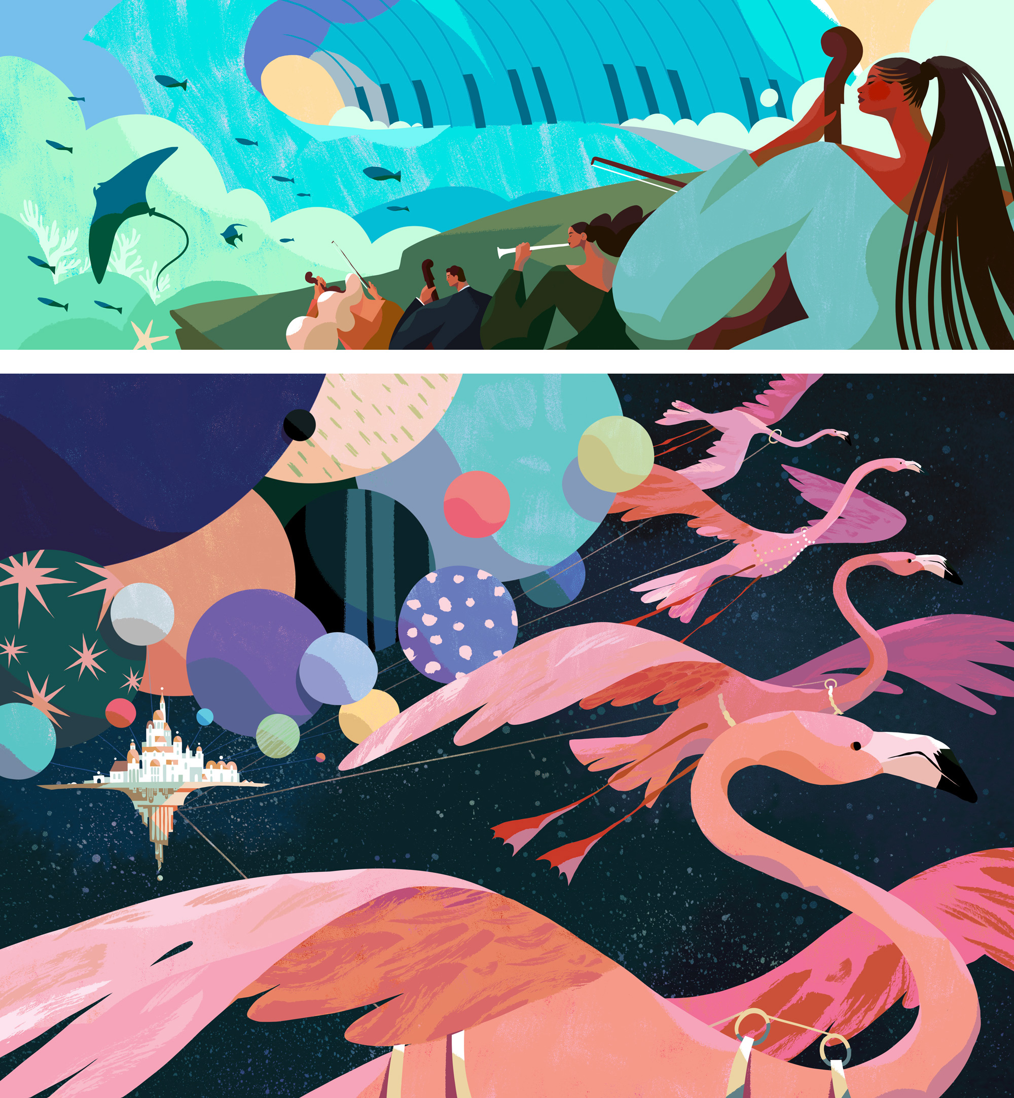
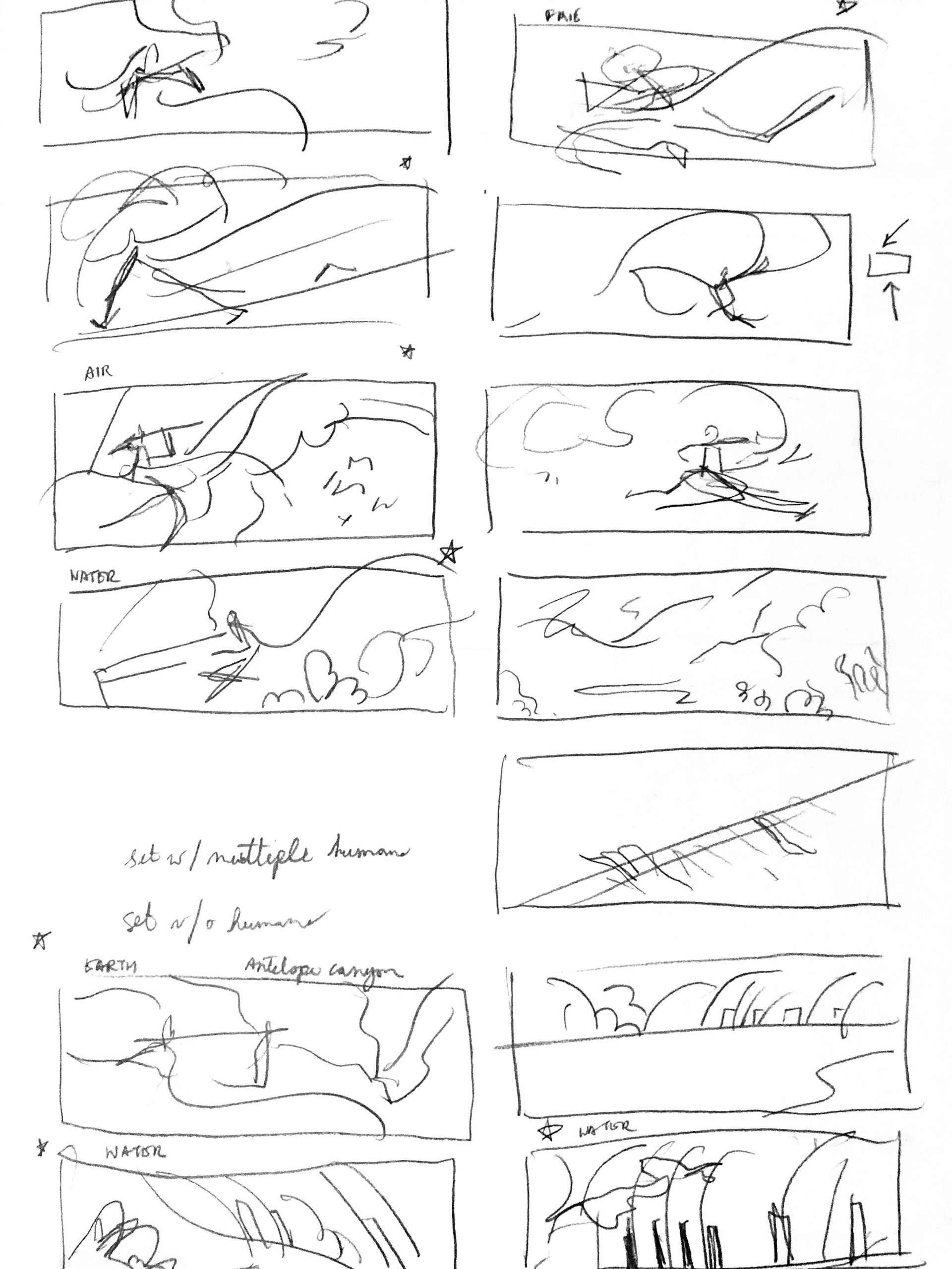
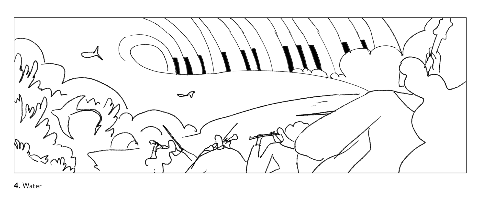
The first project shown is for a component of a Seattle Symphony orchestra poster. The poster is comprised of 4 different panels that should work harmoniously with one another. The panel shown here represents water and is meant to accompany La Mer by Debussy. When working with any client, after the initial creative brief comes the ideation phase. It can be one of the most fun or challenging aspects of the process. Sometimes it starts with word associations after picking apart the brief and absorbing any reading materials provided. From here I make very rough thumbnail sketches with the aim of capturing movement and composition (left below). The ones that look best and capture the nature of the brief get rendered in finer detail to present to the client (right below).
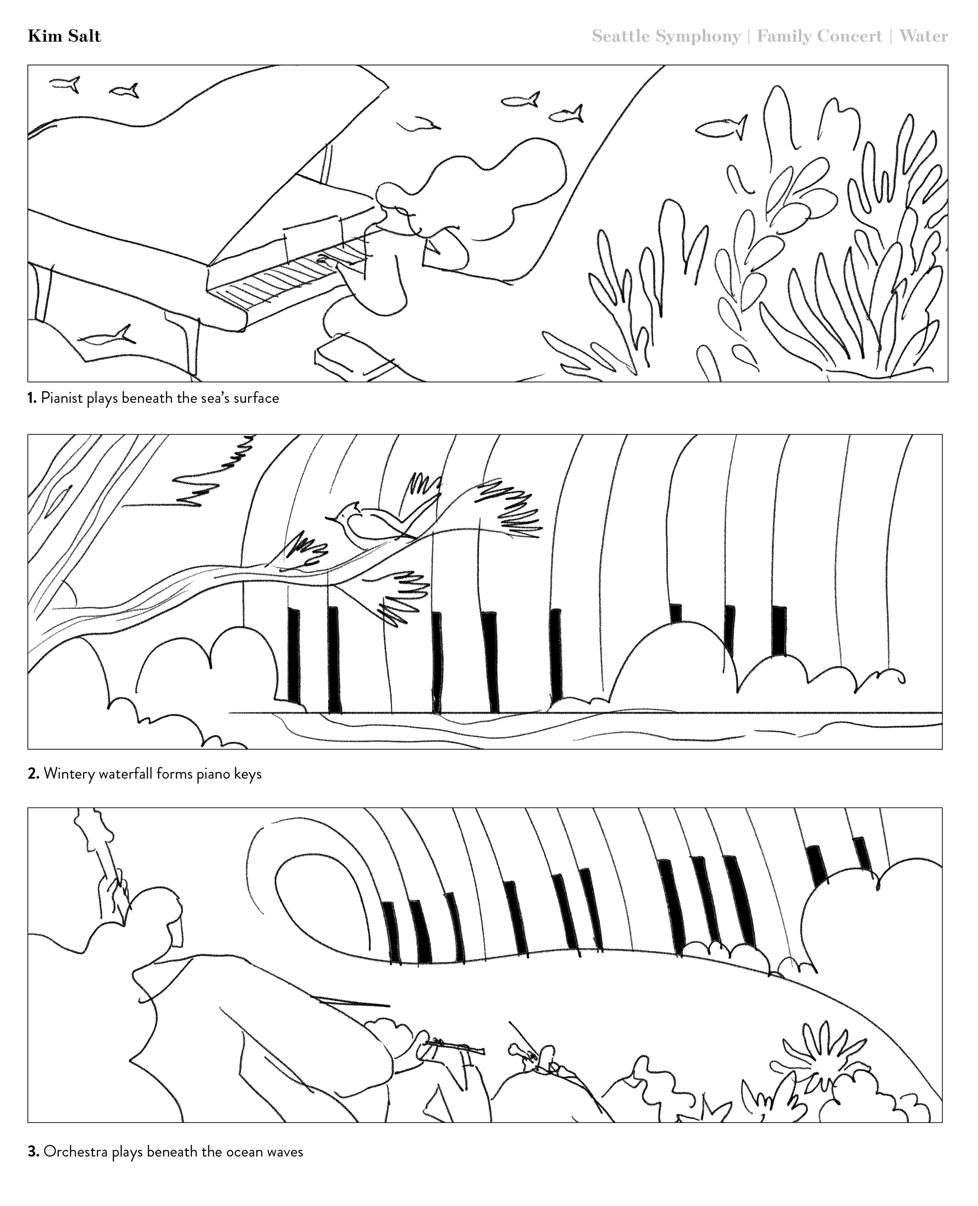
For this piece, the art director was looking for a concept that would represent the dualistic nature of water in both calmness and violence; it was also important to depict the instruments featured in the music. I provided 3 sketch options that I felt best matched what the AD was looking for. At this stage, the AD is also evaluating composition and each of the elements that belong in the illustration. Any edits to these elements are much easier to implement at this stage of the project than later on.
After evaluating the sketch options, the AD felt that sketch #3 was the winner. She also asked for the revision that the musicians not be underwater and provide a clearer emphasis of the gentle and simultaneously powerful ocean. Below is the revised sketch.
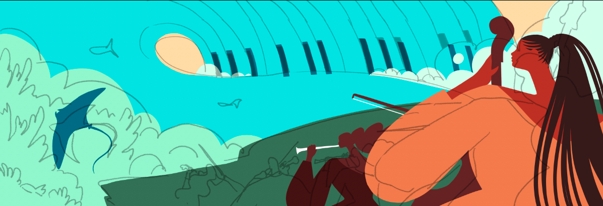
From this stage onward, I can set to work on rendering the sketch out to a final. This approach involves flatting, or locking in the shapes involved in depicting characters and environments. I use the original sketch as a loose blueprint while course correcting for shapes with better movement, more clarity, and more harmonious shape relationships. As you can see in the screenshot below, the sketch and shapes are not exactly 1:1. The colors at this point are not final, and in fact usually pretty obnoxious, so I can better see how the shapes are interacting with one another. This is also one of my favorite stages of the process because it’s easy to zone out and listen to an audiobook or podcast.
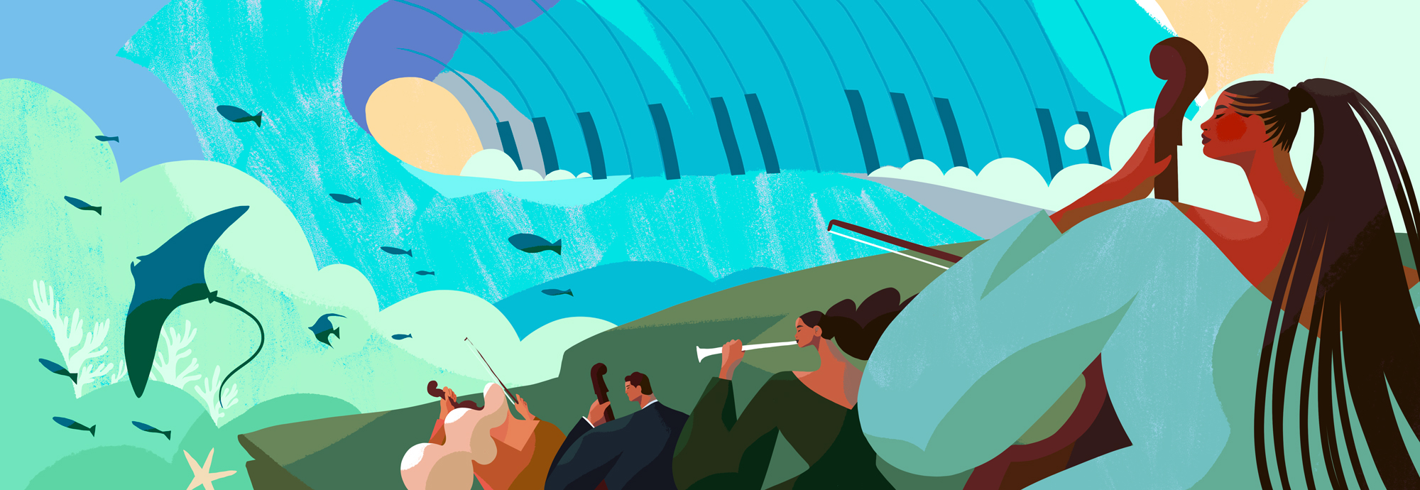
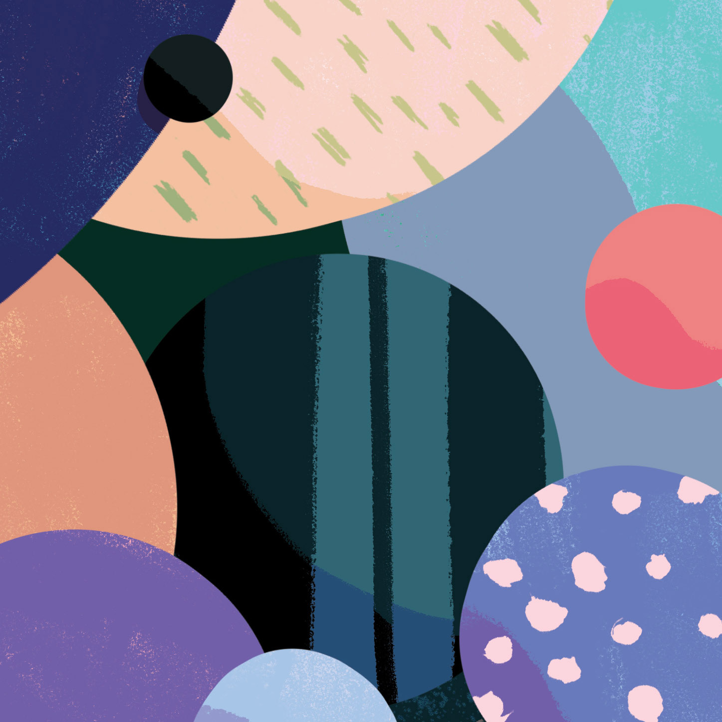
Once all of the shapes are in place, I can worry about the color palette, shading, and fine details. I have a habit of finding my color schemes by sliding the cursor gradually along the color wheel and coming up with analogous colors. At this stage, I also add a black & white adjustment layer to evaluate how each of the tonal values are interacting, so I can adjust my colors as necessary. Below is the final illustration.
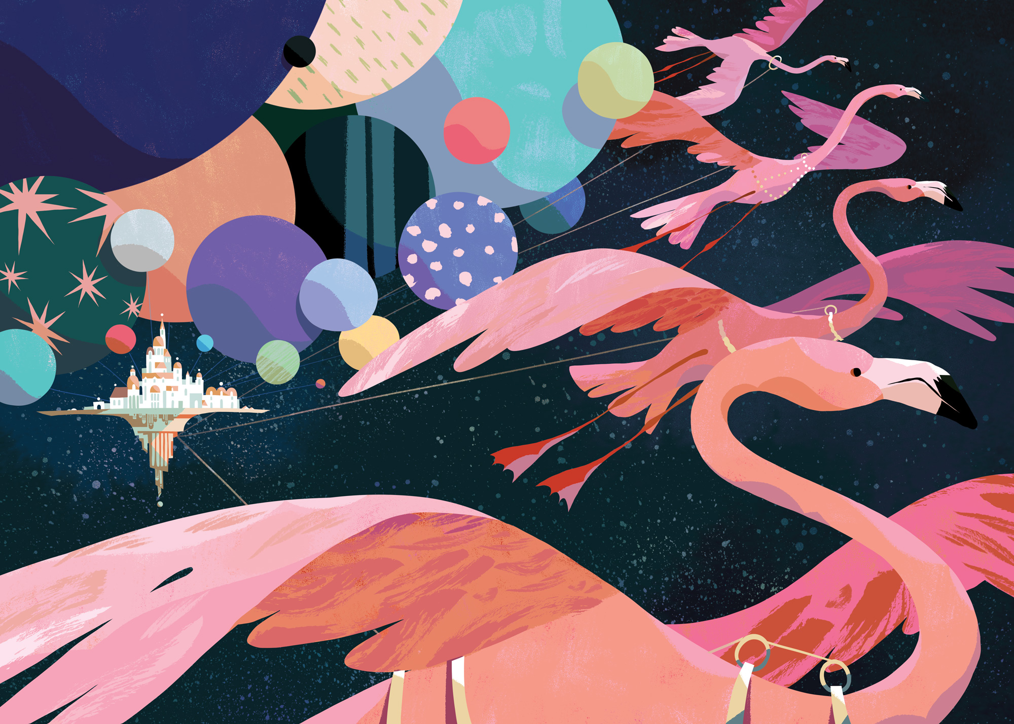
The second project shown here is for an interior spread of Increment Magazine. For context, the creative brief was based off an article about the importance of redundancy in technology. For example, having 4 or more identical computers running identical scripts aboard a space shuttle. These computers are designed to catch one another’s faults and override any errors that may come to harm the safe voyage of the shuttle. I was encouraged by the art director on this project to think beyond the normal visual language involving computers and technology to come up with more of a fantastical metaphor. Because of this, I went overboard in my sketches, with more detail and rendering than I normally provide.
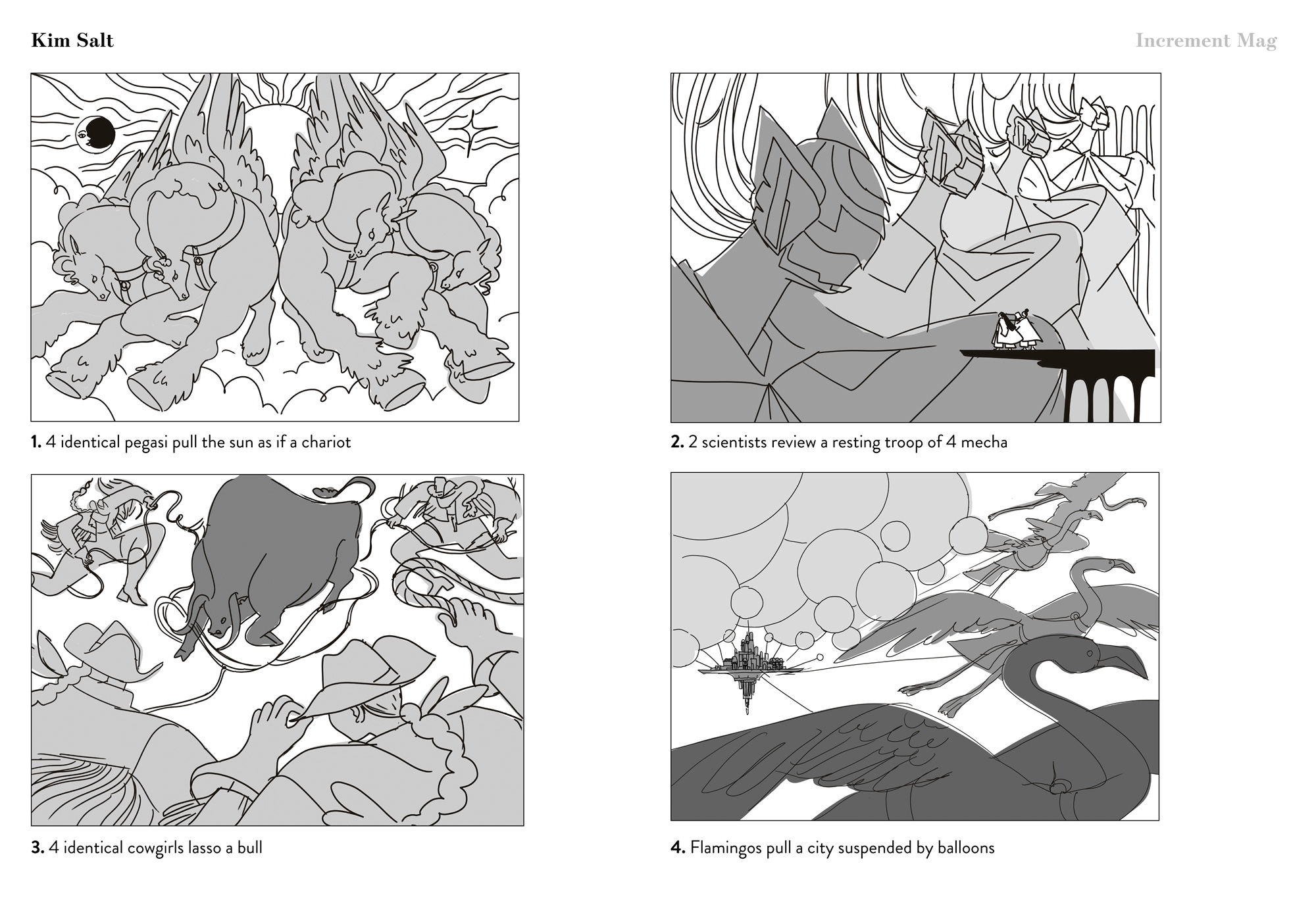
After the AD consulted their internal team, we chose to go with sketch #4. They felt it mapped better to the theme of space travel while representing the core message of the article.
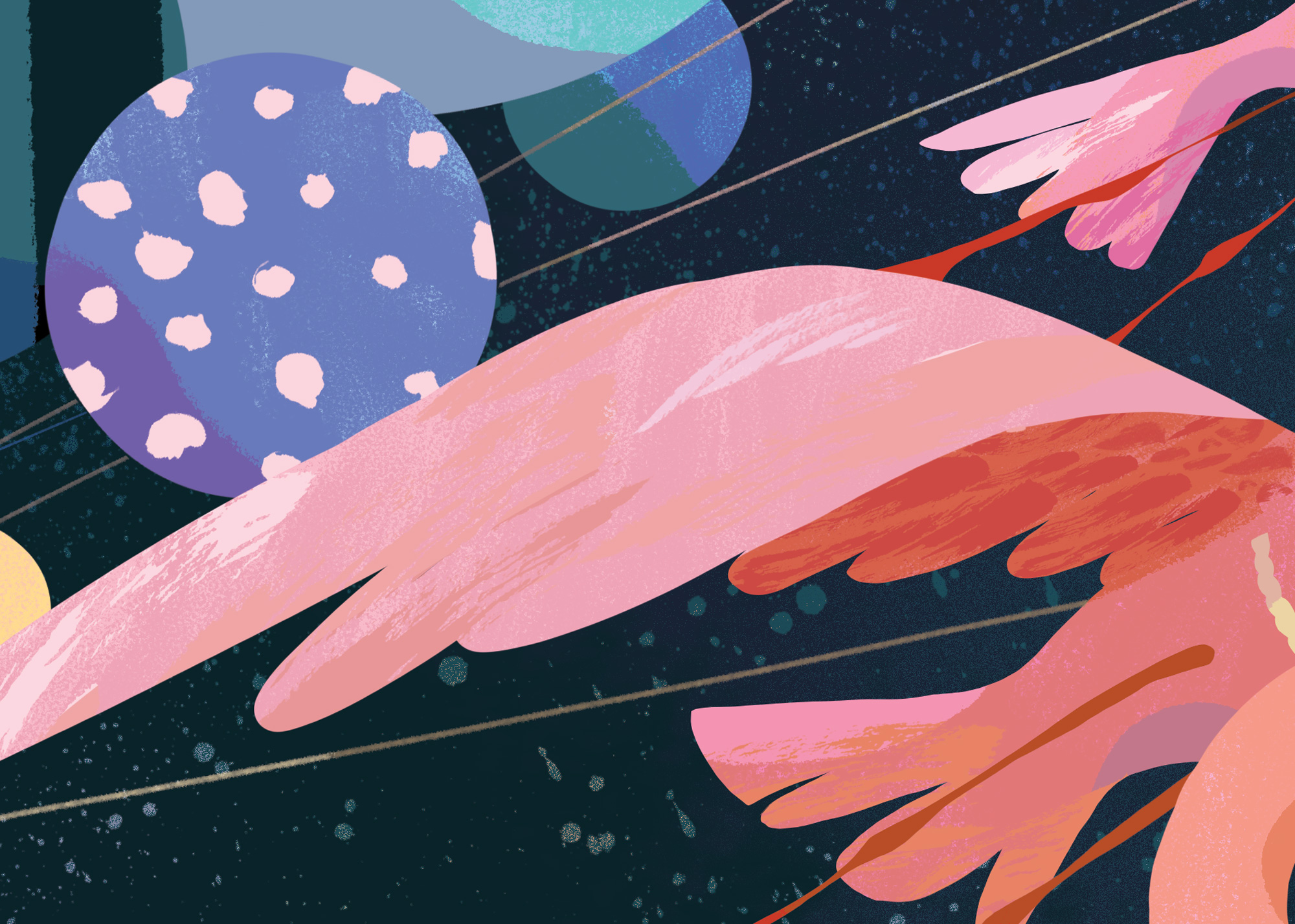
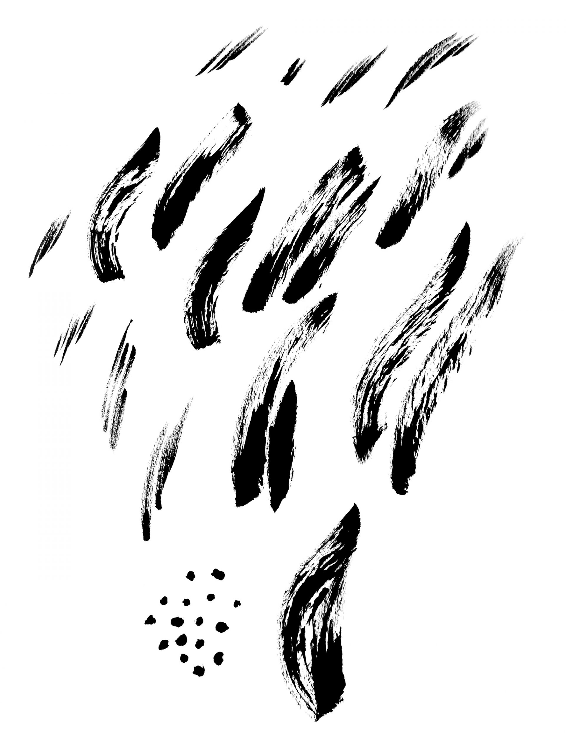
For the final rendering of this illustration, I used the same methodology as the previous one, but felt that this one would benefit from the use of more texture, particularly in large swathes of space. For this, I’ve kept a library of handmade textures for the past 5 years or so comprised of ink brush strokes, spatters, pencil texture, and straight up scribbles (full disclosure, I’ve been using the same 3 or 4 textures in all of my illustrations). I typically use the loose brushstrokes pictured above on hair, fur, and feathers. With a clipping mask, I apply the texture to the shape below (say a flamingo) and lock it to change the color (typically an analogous one).
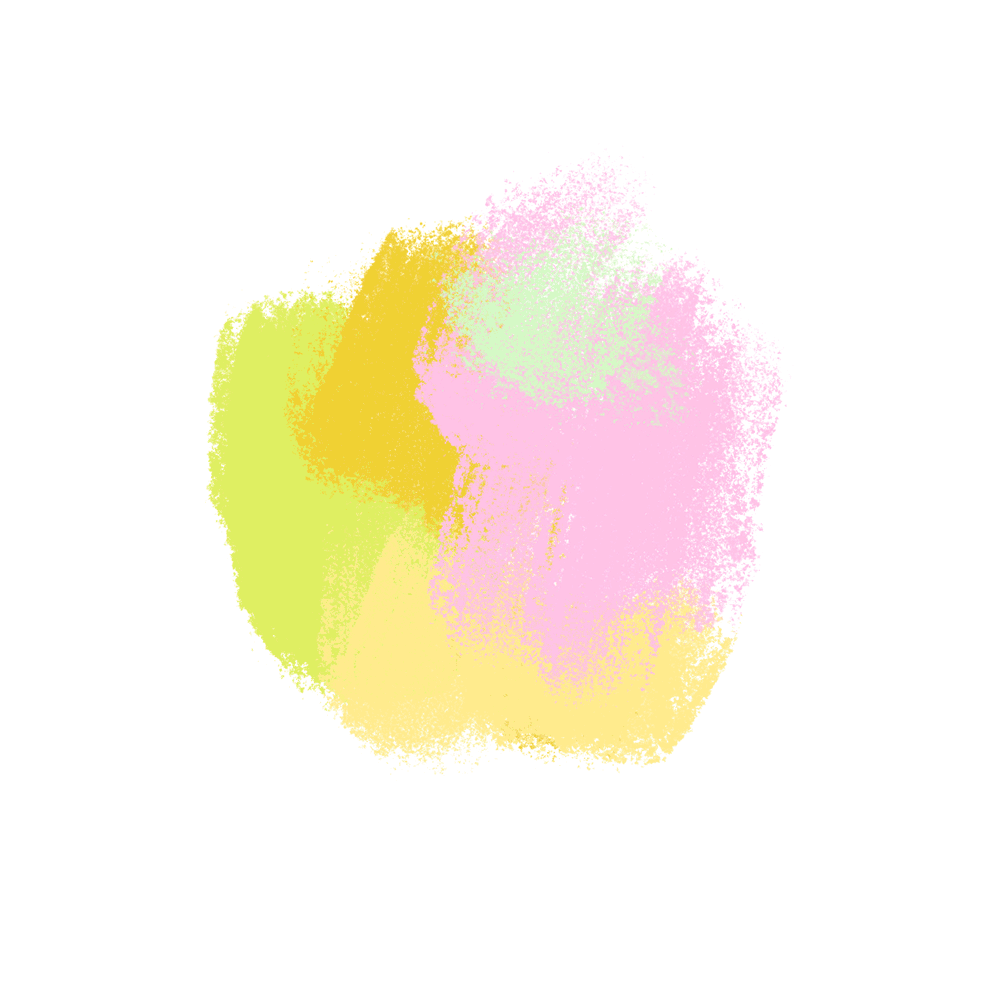
Another aspect of texture-building I use is underpainting. Top right is how I normally go about layering colors to form a richer result. Below is how the finished illustration turned out. Hope this provided a little insight and thanks for reading!